Oplix Unreal Plugin Overview
Compatible with Unreal Engine 5 but may require minor adjustments or recompilation per version (e.g., 5.1, 5.2, 5.3, 5.4+).
The Oplix Plugin provides a flexible and gamepad-friendly bug reporting and feedback system for Unreal Engine projects. Leveraging the Common UI framework, the plugin offers a smooth cross-platform experience and supports comprehensive data submission to the Oplix API.
Quick Start Video
Here’s a tutorial on how to integrate the plugin in under 5 minutes:
The Oplix Plugin has been designed primarily as a starting framework and reference implementation for developers looking to integrate Oplix within Unreal Engine projects using the v2 version of the Oplix API.
We highly recommend that developers:
- Review and modify the source code to align with their project-specific coding standards, naming conventions, and architectural patterns
- Evaluate and adapt the input mappings, UI layer hierarchy, and subsystem logic to ensure clean integration with your project’s Common UI input model
- Treat the default form and tab structure as an example only - design your own row, column, and widget layout to match your project’s UX requirements
Setup Instructions
Place the Oplix folder in the target Plugins directory of your Unreal Engine project, then:
- Enable the Oplix Plugin from the Plugins window in Unreal Engine
- Ensure that the Common UI Plugin is enabled as a dependency
Your plugin should be located at: YourProject/Plugins/Oplix/
The plugin uses the Enhanced Input System for gamepad and keyboard shortcuts.
Input Mapping Context
Input Configuration
| Field Name | Type | Required | Notes |
|---|---|---|---|
Input Mapping Context | IMC_Gamepad | Optional | Located at Content → Blueprints → Input |
Toggle Action | IA_ToggleBugReport | Optional | Opens/closes the Oplix feedback window |
Default Keyboard Bind | F9 | Optional | Default keyboard shortcut |
Controller Setup | Enhanced Input Subsystem | Optional | Bind IMC_Gamepad to Player Controller (see Sandbox level blueprint for reference) |
Common Input Settings
Navigate to Project Settings → Common Input Settings and configure:
Input Data Asset:
- Set to
B_CommonInputData - Includes UI input actions: Back, Forward, Confirm
Platform Input Settings (Windows):
- Default Controller Data:
GenericGamepad - Enables automatic gamepad icon switching based on input device
The plugin is fully gamepad-friendly and will automatically switch between keyboard and controller icons based on the active input device.
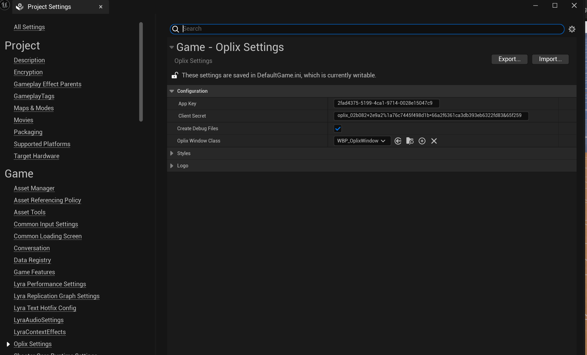
Navigate to Edit → Project Settings → Oplix Settings and configure the following:
Required Settings
| Field Name | Type | Required | Notes |
|---|---|---|---|
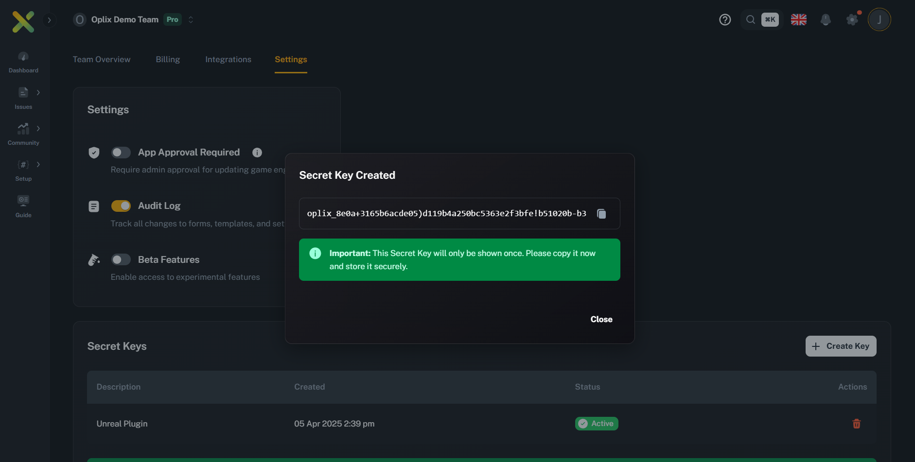
App Key | String | Required | Your unique application key from Oplix Dashboard |
Client Secret Key | String | Required | Your secret credential from Team Settings |
Window Class | Widget Class | Required | Assign to WBP_OplixWindow (or your custom widget) |
To ensure the plugin functions correctly, set up the styles for buttons and editable text boxes. The plugin includes default styles, but they still need to be configured within the editor.
Navigate to Project Settings → Oplix Settings → Styles to configure visual appearance.
You can either create new Blueprints for each style and assign them in settings, or edit the default provided styles for a tailored look.
Usage and Form Handling
Forms are dynamically generated based on templates received from the Oplix API:
- Each form is organized into tabs using the TabsListWidget
- Full gamepad navigation support:
- Controller Shoulder Buttons for switching tabs
- Face Button Bottom (e.g., “A” on Xbox, “Cross” on PlayStation) for selection
- Seamless support for both gamepad and mouse/keyboard input

Customization Options
All customization options can be accessed in Project Settings → Oplix Settings → Styles
The plugin uses Common UI styling framework:
- CommonBorderStyle for the Window
- CommonButtonStyle for various button types
- CommonTextStyle for text elements
CommonButtonStyle incorporates text styles, providing a cohesive and flexible design framework.

Window Configuration
Window Settings
| Field Name | Type | Required | Notes |
|---|---|---|---|
WindowWidth | Number | Optional | Window width in pixels (default: 1200) |
WindowHeight | Number | Optional | Window height in pixels (default: 800) |
WindowTitle | String | Optional | Displayed window title text |
WindowBorderStyle | CommonBorderStyle | Optional | Border appearance configuration |
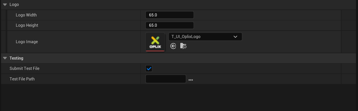
Logo Settings
Logo Configuration
| Field Name | Type | Required | Notes |
|---|---|---|---|
LogoWidth | Number | Optional | Logo width in pixels |
LogoHeight | Number | Optional | Logo height in pixels |
LogoImage | Texture2D | Optional | Custom logo texture to display in UI |
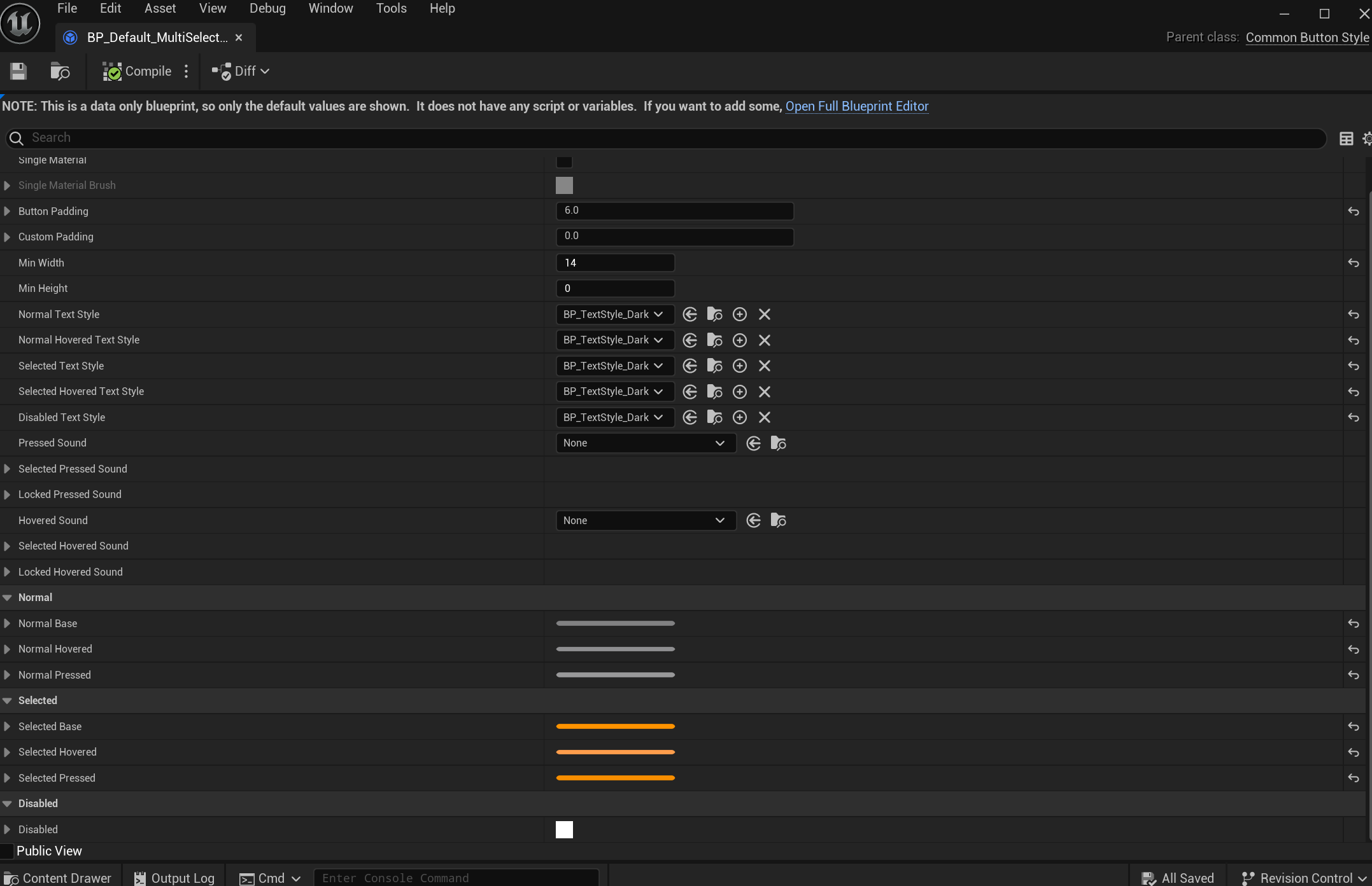
Button Styles
Button Style Configuration
| Field Name | Type | Required | Notes |
|---|---|---|---|
Submit Button | CommonButtonStyle | Optional | Style for submission actions |
Close Button | CommonButtonStyle | Optional | Style for closing the form or window |
Tab Button | CommonButtonStyle | Optional | Style used for navigation tabs |
Switch Button | CommonButtonStyle | Optional | Style for toggle/switch buttons |
Rating Button | CommonButtonStyle | Optional | Style for rating-based inputs |
Multi-Select Button | CommonButtonStyle | Optional | Style for buttons used in multi-select options |
Text Input Settings
Editable TextBox Configuration
| Field Name | Type | Required | Notes |
|---|---|---|---|
SingleLineEditableTextboxHeight | Number | Optional | Height for single-line text boxes (default: 40) |
MultiLineEditableTextboxHeight | Number | Optional | Height for multi-line text boxes (default: 100) |
EditableTextBoxStyle | CommonTextStyle | Optional | Appearance of text boxes used for input fields |
Dropdown Menu Configuration
Dropdown Settings
| Field Name | Type | Required | Notes |
|---|---|---|---|
DropdownInputHeight | Number | Optional | Height of dropdown menus |
DropdownStyle | Style Asset | Optional | Overall dropdown menu appearance |
DropdownEntryStyle | Style Asset | Optional | Individual dropdown entry appearance |
DropdownFont | Font Asset | Optional | Font style for dropdown entries |
DropdownForegroundColor | Color | Optional | Foreground color for dropdown entries |
Switch Styles
Switch Configuration
| Field Name | Type | Required | Notes |
|---|---|---|---|
Button Style | CommonButtonStyle | Optional | Button style for switches (affects background) |
SwitchOnColor | Color | Optional | Color when the switch is toggled ON |
SwitchOffColor | Color | Optional | Color when the switch is toggled OFF |
Widget | WBP_Switch | Optional | Implemented using a slider widget |
Text Styles
Text Style Configuration
| Field Name | Type | Required | Notes |
|---|---|---|---|
QuestionTextStyle | CommonTextStyle | Optional | Text style for questions within the form |
SubmitStatusTextStyle | CommonTextStyle | Optional | Appearance of submit status text (e.g., 'Submitting...', 'Form submitted successfully') |
WindowTitleTextStyle | CommonTextStyle | Optional | Font and color of the window title |
Testing File Attachments
This feature is useful for verifying that the file attachment process is working correctly with the Oplix backend without requiring manual file selection during every test submission.
To simplify testing the file attachment functionality during development, the Oplix plugin provides an option to automatically attach a designated test file to every feedback submission.
Configuration
Go to Project Settings > Plugins > Oplix and scroll down to the Testing category.
Check the Submit Test File box to enable automatic attachment of the specified test file.
Use the Test File Path setting to select the file you want to attach automatically. Click the browse button (…) to choose a file from your project or computer.
The path selected here must point to an existing file at the time of submission. The subsystem will attempt to resolve the path and log a warning if the file cannot be found, but it will not prevent the rest of the feedback from being submitted.
How it Works
When Submit Test File is enabled in the settings, UOplixSubsystem::SubmitFormData will automatically:
- Retrieve the file path specified in Test File Path
- Convert it to an absolute path
- Verify that the file exists
- If the file exists, add its path to the list of files being sent in the
multipart/form-datarequest to the Oplix backend under thefilesfield name, alongside any other files programmatically attached via theOptionalFilePathsparameter
This feature is intended for development and testing purposes only. Ensure Submit Test File is unchecked in your final build configurations unless you specifically intend for this test file to be included in all user submissions.
API & Key Components
Blueprint Functions
Toggle Form Visibility
Use the ToggleOplixForm Blueprint node to show or hide the Oplix form with a single function call.
[Event BeginPlay] ---> [Toggle Oplix Form]This can be bound to any input event, button press, or triggered programmatically based on your game’s logic.
Core Subsystems
OplixSubsystem
The central coordinator that manages communication with the Oplix API for data submission.
Responsibilities:
- Handles authentication and token management
- Collects screenshots automatically
- Gathers system specifications and device info
- Submits form data to the Oplix backend
OplixWindow
The main UI window that organizes multiple forms into tabs for easy navigation.
Features:
- Uses
OplixFormWidgetto handle dynamic field generation - Supports tab switching with gamepad shoulder buttons
- Manages form state and submission status
- Displays branding and custom logos
UI Widget Hierarchy
The plugin uses a modular widget architecture:
OplixWindow (Main Container)
- Handles overall window display
- Manages tab navigation
- Shows branding/logo
OplixFormWidget (Form Renderer)
- Dynamically generates form fields based on API templates
- Tracks user input and validates required fields
- Handles form submission
OplixRowWidget (Field Container)
- Layouts individual form fields
- Contains input elements (text boxes, dropdowns, ratings, etc.)
- Manages field-specific validation
Your Oplix plugin is now configured! Players can submit feedback directly from your game with full gamepad support.